
Slice Configuration
In addition to fields there are a couple other properties you can set in your slice to give content managers a little more information about that slice.
Description
Descriptions appear in the slice selector when adding them to a page and give the content manager a little more context about what they are about to select.
...
@section('component')
<script>
  var component = {
    preview: ['{B, Bbg, B}'],
    description: 'Card with information',
    fields: {
    ...
TODO: Screenshot of slice selector
Previews
Previews are wireframes that Devise will draw for you when you provide it with some markup that describes how the slice generally looks. This wireframe, like all wireframes, isn't meant to be a perfect representation but to provide the user with a visual cue of what to expect when selecting a slice.
The markup is an array of strings that represent a full row. of the drawing. There is 250px of height to work with. Here is how the syntax works for a single row:
'{[Element Type (uppercase)][Element Settings (lowercase)]}[Height of row]
If you had an image above a title with a paragraph below it you might have markup like this:
You can also put multiple elements on a single row by separating them with a comma like-a-so:
['{B, I, B}', '{B, Tlg~2, B}', '{B, Tsm~10, B}']
This would produce the following:
Preview Element Types
Text
Text is represented by T and can have any number of the following settings trailing it:
Alignment
cCenter Text
rRight Align TextExample: Center aligned text
['{Tc}']
Size
lLarge
xlExtra Large
sSmallExample: Extra large center aligned text
['{Txlc}']
Styles
bBold
iItalicExample: Bold AND italic text
['{Tbi}']
Number of Words
~10This would generate 10 wordsExample: Bold extra large text with 5 words
['{Tbxl~5}']
Image
Image is represented by I and can have any number of the following settings trailing it. Note that the default height of an image is 100px.
Sizes
sSmall
xsExtra SmallExample: Large image
['{Il}']
Video
Video is represented by V and can have any number of the following settings trailing it. Note that the default height of a video is 100px.
Sizes
sSmall
xsExtra Small
Forms
Forms are represented by F and can have any number of the following settings trailing it. Sizes determine the number of form fields that will appear. Two fields and a submit button appear by default.
Sizes
xsJust the submit buttons
sOne form field and submit
lThree form fields and submitExample: One form field and submit
['{Fs}']
Blank
Blanks are represented by B and can have any number of the following settings trailing it. Default height is 100px Blanks serve two purposes:
They can fill empty space so you can push things over on a row
By adding a
bgyou can represent arbitrary blocks.
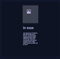
Example: A thin card-style layout
['{B, I, B}30', '{B, Txl~2, B}20', '{B, Txs~30, B}']
Fill
bgFills the blank area to make it.... not blank.Example: Three filled in blocks that are 50 pixels high
['{Bbg, Bbgs, Bbg}50']
Sizes
sSmall
xsExtra Small
Last updated